To answer this question, we have to take a closer look at medicine.
But why green?
The retina in the human eye consists of several cell layers, the rearmost layer (consisting of rods and cones) is responsible for converting the incident light in signals. The rods are „colour-blind“ and can only process light intensities. The cones allow colour vision and light-dark perception.
Since the rods react particularly strongly to blue-green light (with a wavelength of about 500nm), the sensitivity of the human retina shifts in this direction during darkness. Pictures are perceived differently during the day than in the dark. In sunlight, for example a red appears more vivid and brighter, while at night the green and blue tones are perceived as brighter.
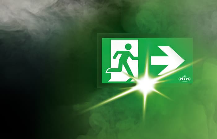
Since escape signs should be bright and clearly visible in periods of limited visibility, such as darkness (power failure) or smoke development, they are kept in green.
A pictogram (symbol) in white, which explains the respective information of the sign to the viewer, is depicted on an escape sign. The images are reduced to the essential and kept gender- and culture neutral, which ensures the international understanding of the signs. All symbols are white (RAL 9003 signal white) on a green (RAL 6032 signal green) background according to DIN 5381.
However railway, tram and subway tunnels are exceptions. Emergency exits are marked with blue signs to ensure, that they aren’t confused with the green railway signals.
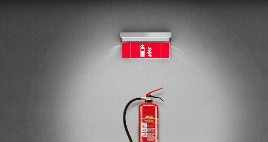
If you see red signs, then these are prohibition or fire protection signs, yellow means warning and mandatory-signs are kept in blue.
On customer request we produce almost an unlimited range of special pictograms. Just send us your request and let us know what you want.


